03ISUAL
Making a complex SaaS product clearer.
Redesigning a B2B digital marketing platform by connecting product needs, business goals and a simpler user experience.
- Client
- ISUAL
- Role
- UX/UI Designer
- Focus
- UX Review, Competitive Benchmarking, User Story Mapping, UX/UI Design, Prototyping
- Period
- 2024
01The challenge
A complex product needs a clear direction.
ISUAL is a B2B SaaS platform that helps brands amplify the distribution of their digital content through a network of partners and employees. The project asked to rethink the experience of the platform and give its evolution a clearer direction, considering both how the product works and the client's business goals.
My work started from the existing documentation, usage statistics and operational flows, to understand where the product struggled and what could be improved.
02From analysis to decisions
Understanding what to simplify, what to rethink and what to prioritise.
I ran a UX Review of the existing product and a competitive benchmark, using the results to discuss possible evolutions and new opportunities with the client.
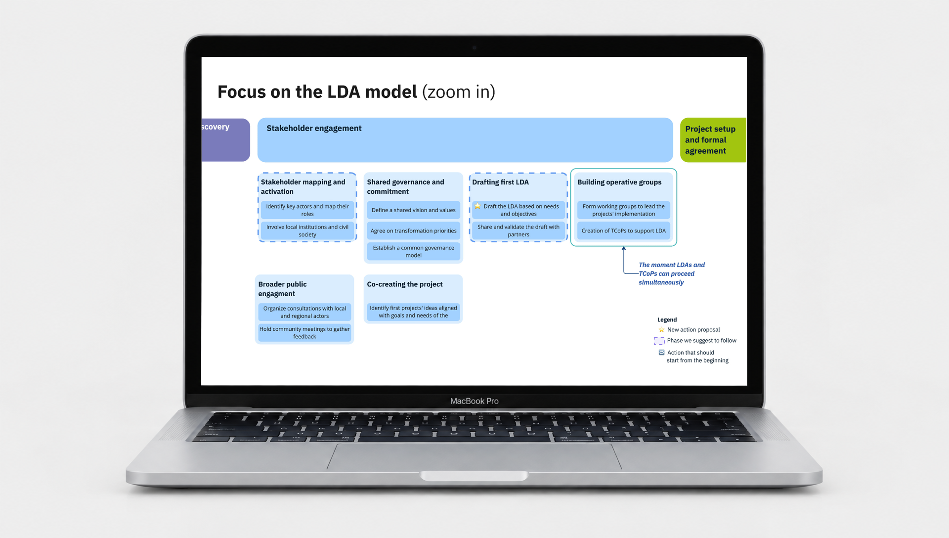
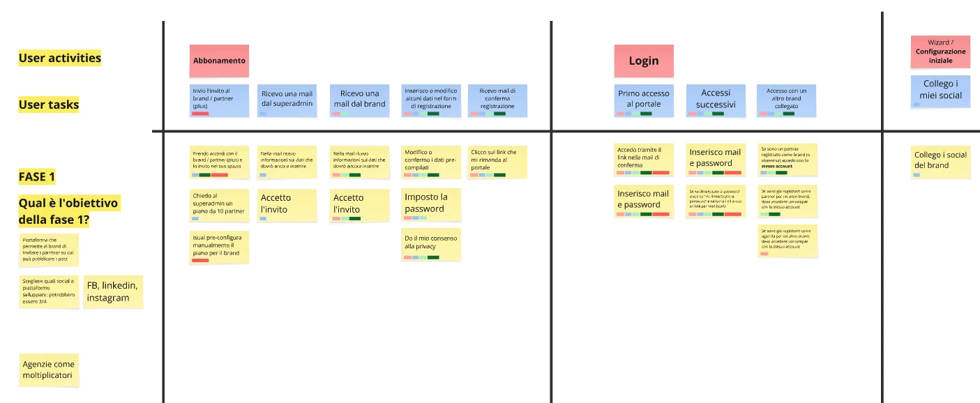
Together with the team and the client we defined priorities through a User Story Map, organising the features into epics and releases.
The decisions came from weighing needs, opportunities, feasibility and budget — not from aesthetic preference alone.
Clarify
Make the flows and the way the product works easier to understand.
Prioritise
Organise the features around project priorities and business goals.
Simplify
Rethink processes so the same flow doesn't multiply into unnecessary variants.
One concrete example: instead of building separate paths for every type of profile, we designed a single unified administration process — simplifying the flow, containing the work needed, and documenting the specific differences in text.
03The solution
A clearer product, made tangible through a prototype.
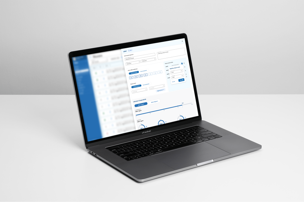
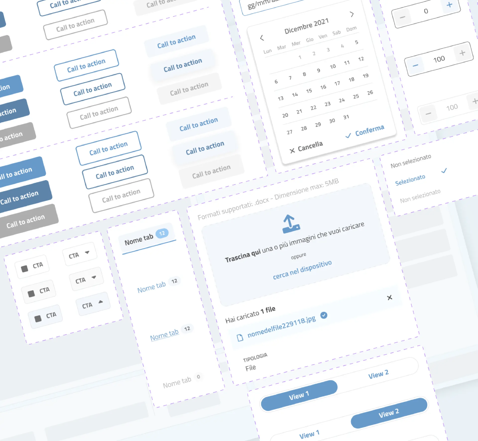
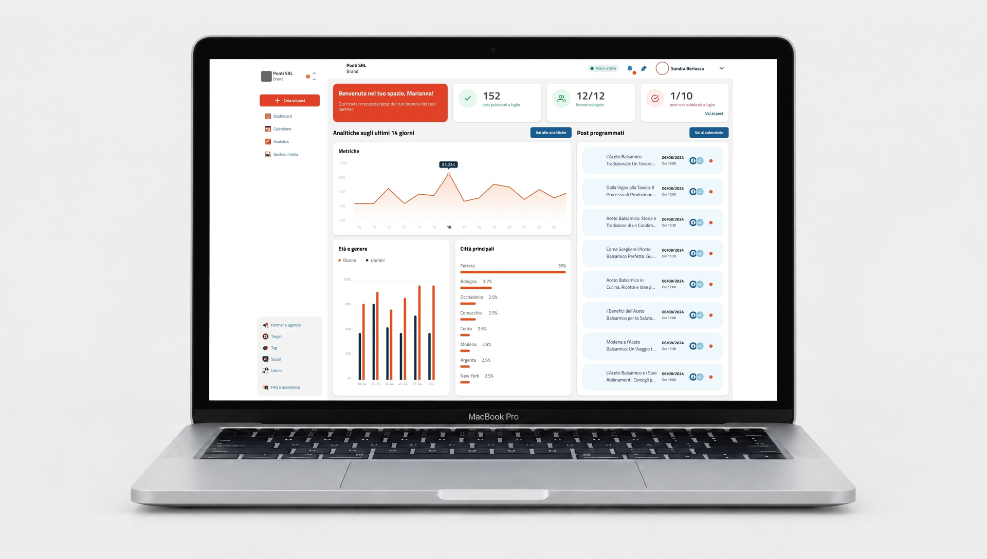
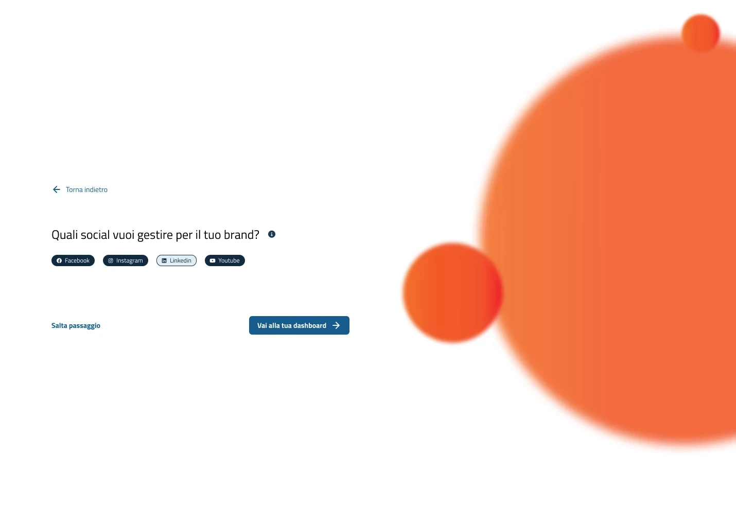
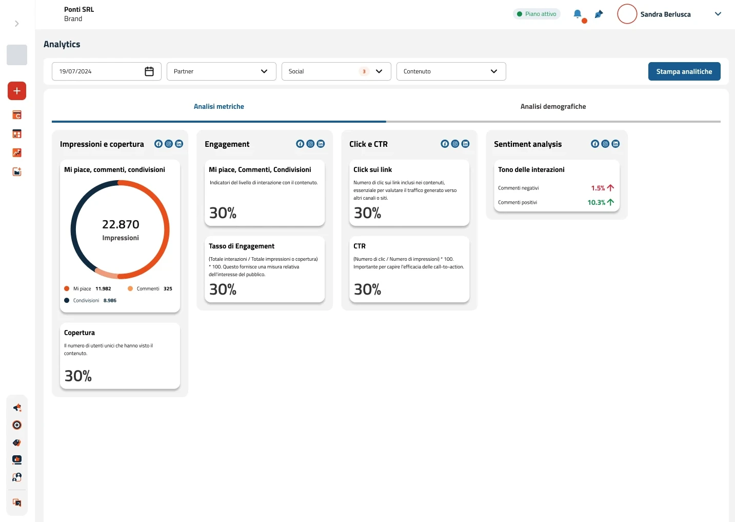
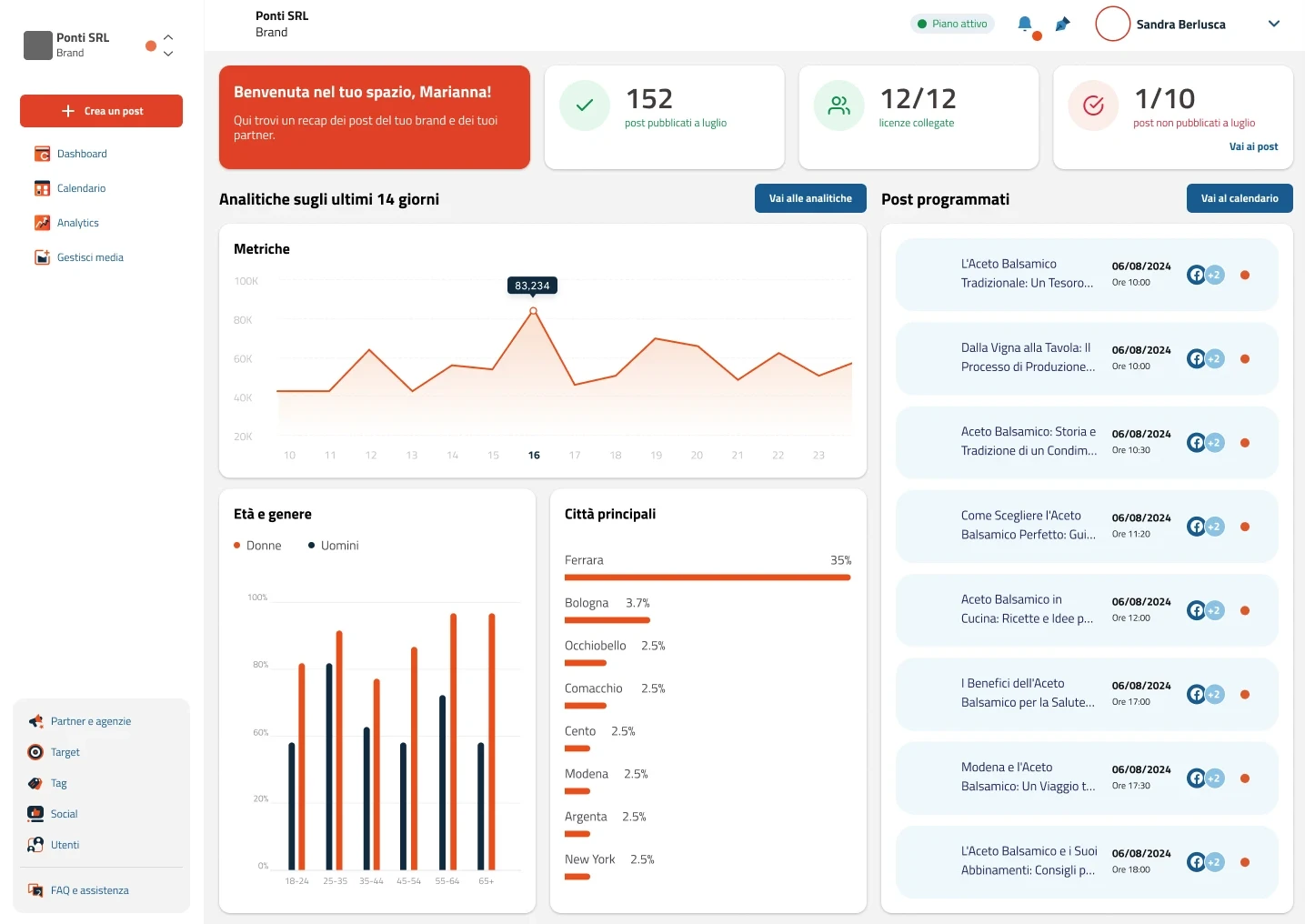
I designed the flows, the wireframes and the interface of the four main pages, defining the foundations of a Design System.
The navigable Figma prototype made the new product direction concrete — a way to present it to stakeholders and investors before development.
04Outcome
Turning product complexity into a direction people can understand.
- A renewed UX/UI proposal for the platform
- Flows and priorities defined and shared with the client
- A navigable prototype used to present the new product direction to stakeholders and investors
The project meant balancing ambitions for evolution, different needs and a limited budget. Within that, my contribution was to turn the opportunities that emerged from the analysis into concrete design decisions that could be discussed with the client.
Good product design isn't about adding more possibilities. It's about making the right ones easier to understand and use.