02Safety21 / Design System
Eight portals. One shared language.
Building a shared Design System to bring consistency, clarity and autonomy across a fragmented digital ecosystem.
- Client
- Safety21
- Role
- UX/UI Designer — Design System Lead
- Focus
- Design System, UI Architecture, Documentation, Design–Development Collaboration
01The challenge
Different products. Different rules. No shared system.
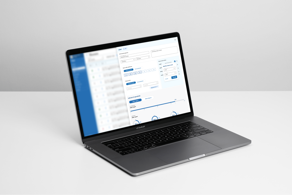
Safety21 managed eight portals coming from different realities, each with its own components, visual conventions and ways of implementing things. There was no shared library and no coherent set of rules: designers recreated similar elements, and developers implemented them in different ways.
Aligning the visual identity was only part of the problem. The deeper need was a shared way of working — one that could make the products more coherent and the development process more efficient.
02From fragmentation to a shared system
Standardising what could be shared, preserving what needed to be different.
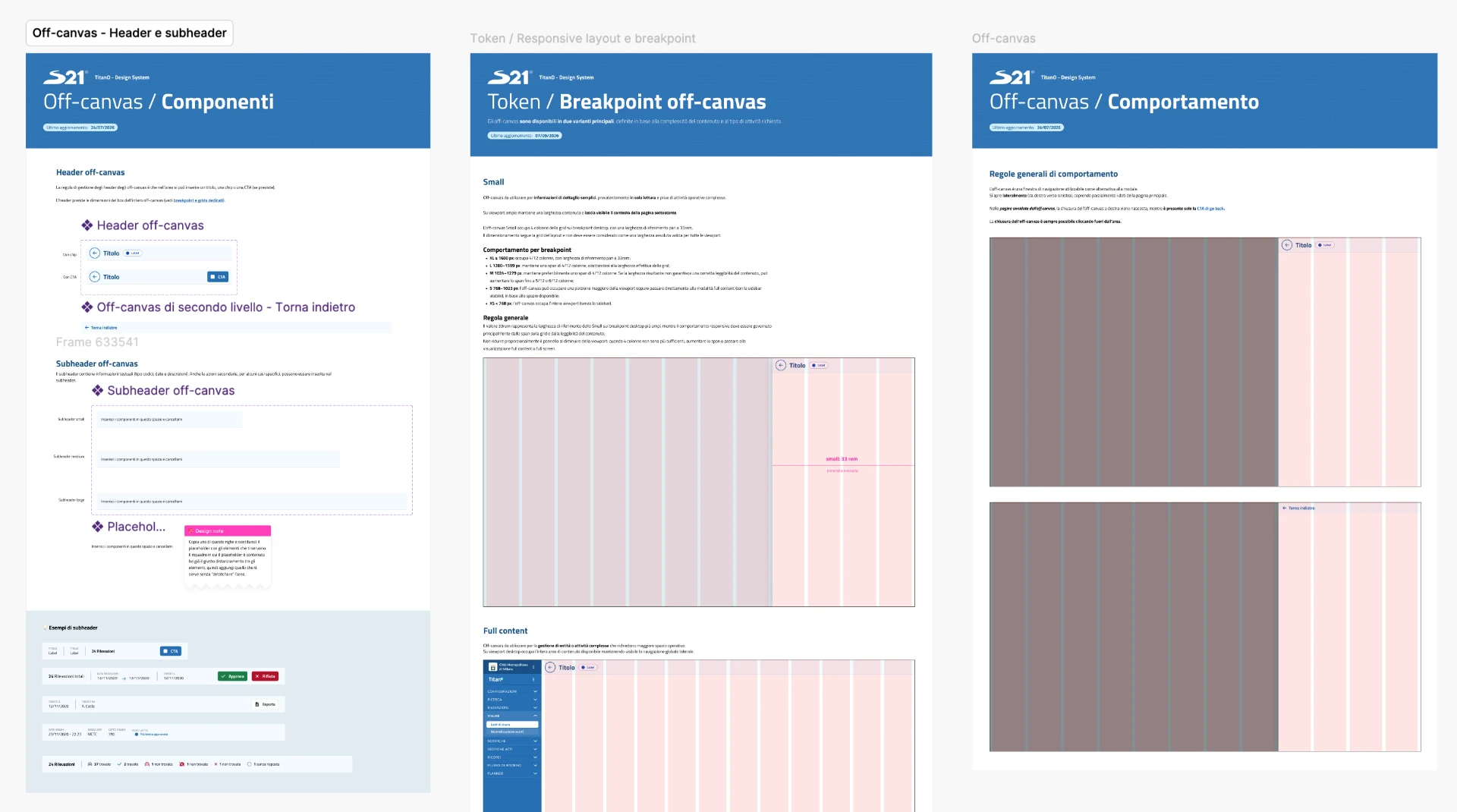
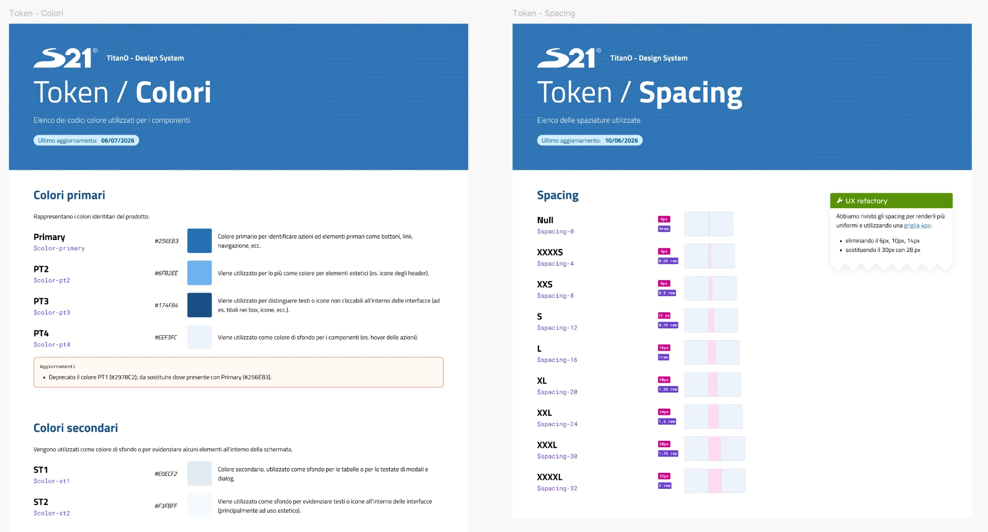
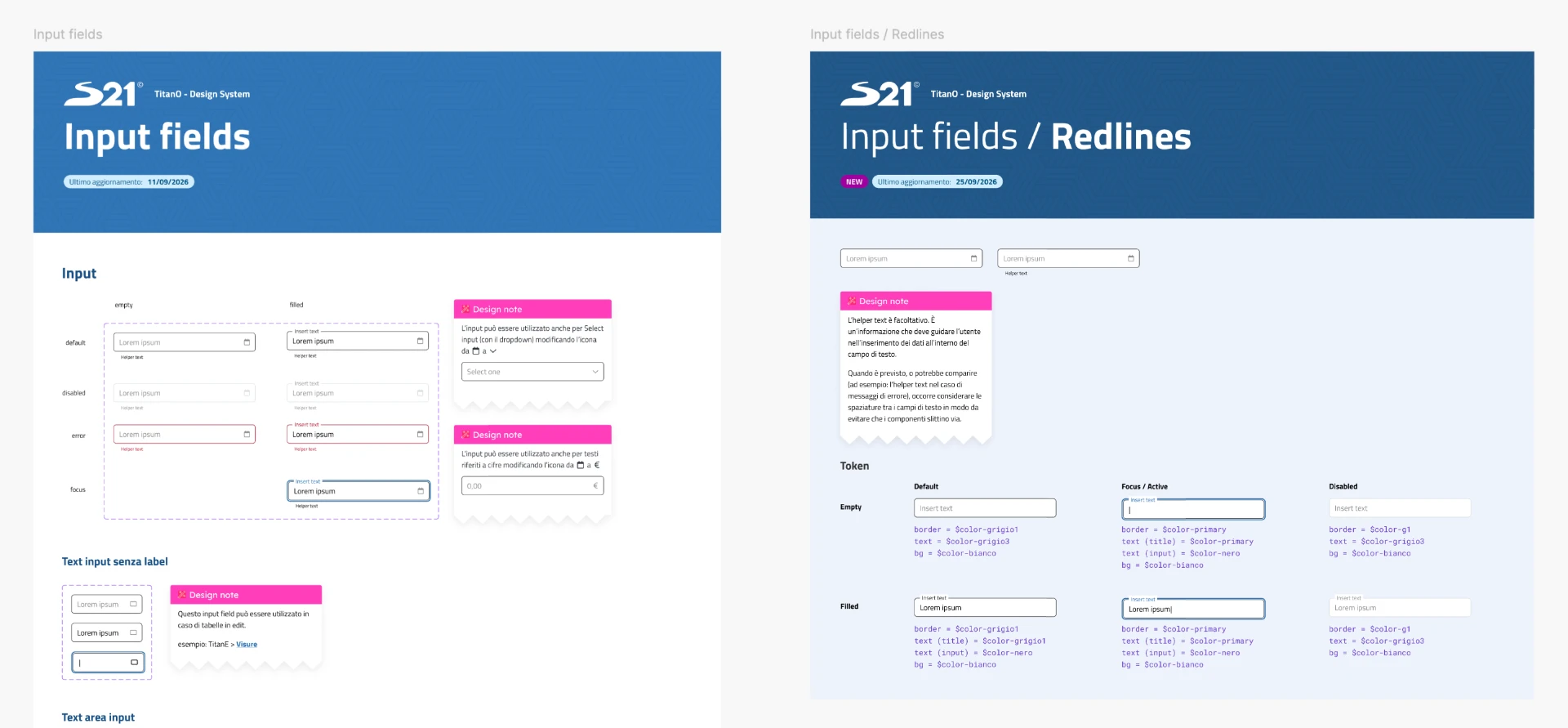
I contributed to the audit of the products, the structure of the Design System and the creation of components, patterns, naming rules and documentation.
The system was built from scratch, considering the brand identity, the needs of the products, accessibility and technical constraints. Working closely with developers was essential to define solutions that could actually be used.
Standardise
Identify recurring elements and behaviours to make shared across the portals.
Document
Define components, rules and the reasons behind decisions, creating a common reference.
Enable
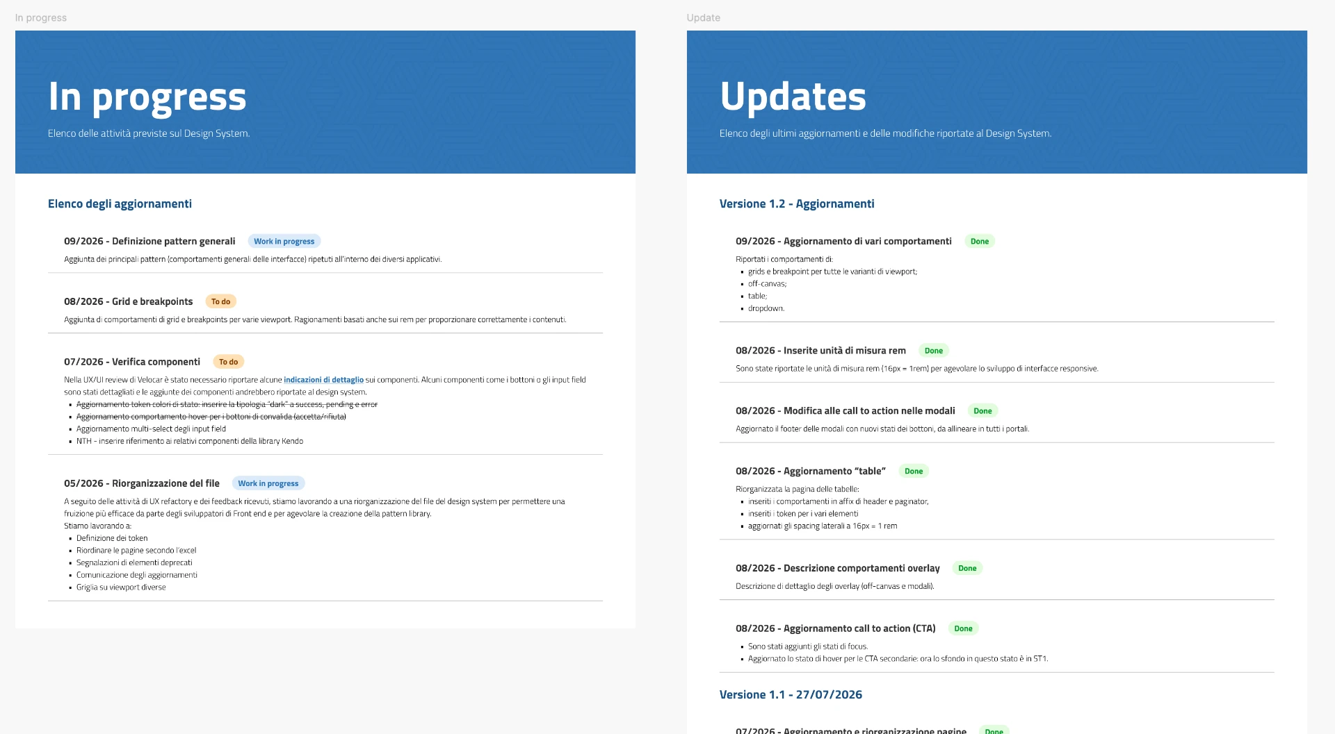
Let designers and developers work autonomously, reducing ambiguity and constant visual checks.
The goal was never to make every portal identical — it was to distinguish what could be standardised from the specific needs that had to remain.
03The solution
From individual components to a common design language.
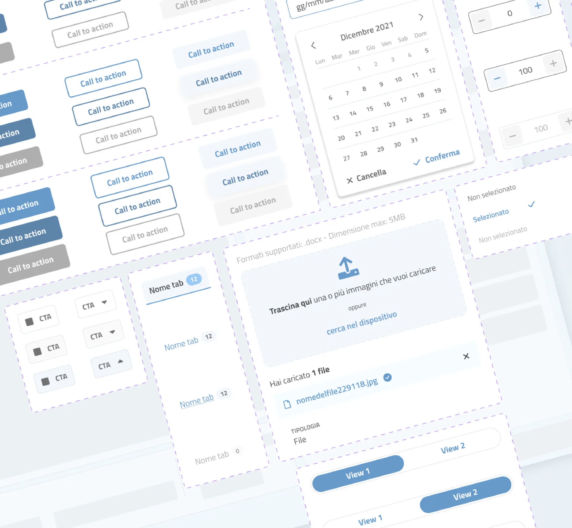
Beyond visual coherence, the system standardises recurring behaviours and flows — so the same interaction works the same way in every portal.
04Outcome
Less time recreating. More time designing what matters.
- Greater consistency across the portals
- Reuse of components and patterns
- More autonomy for developers in implementing visual details
- More structured collaboration between design and development
- More room for UX work on information and flows
- A documented, maintainable foundation for the evolution of the products
My role covered the definition and management of the Design System: the documentation, the shared library, the dialogue with developers and the review process.
A Design System is more than a collection of components. It's a shared language that helps people build better products together.